CONCEPT
Project Overview
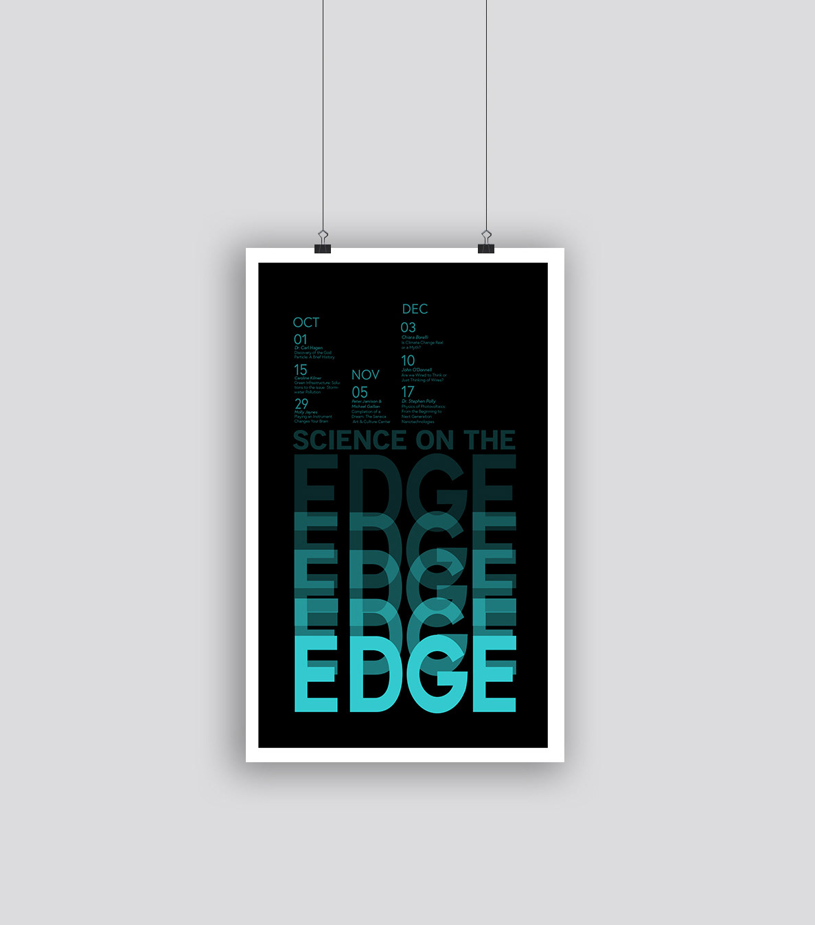
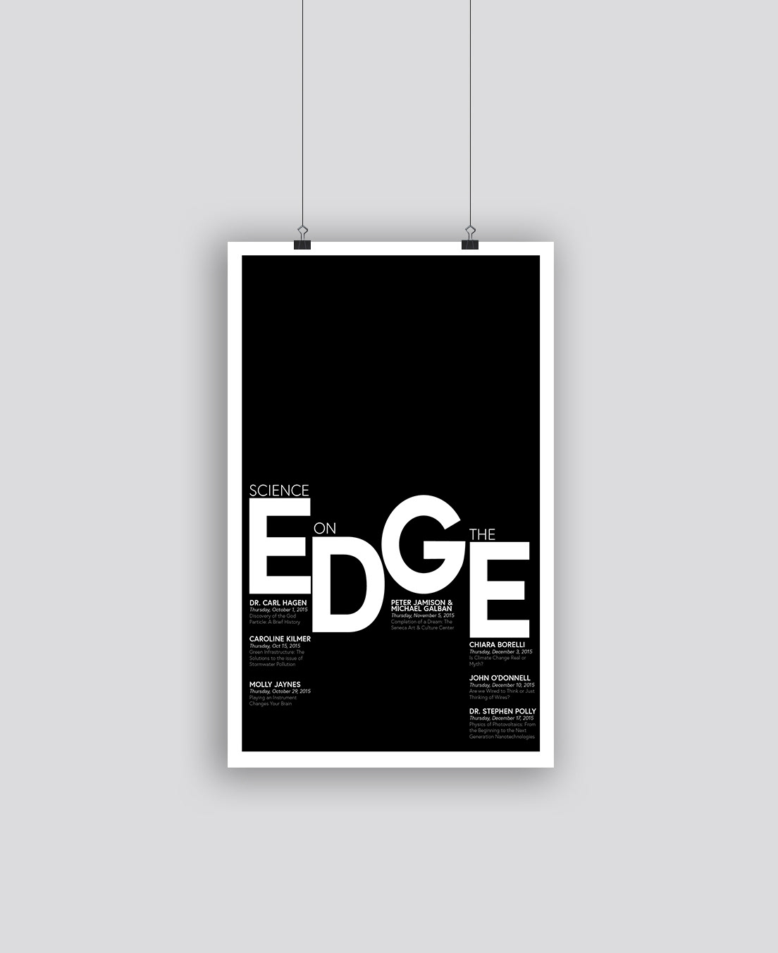
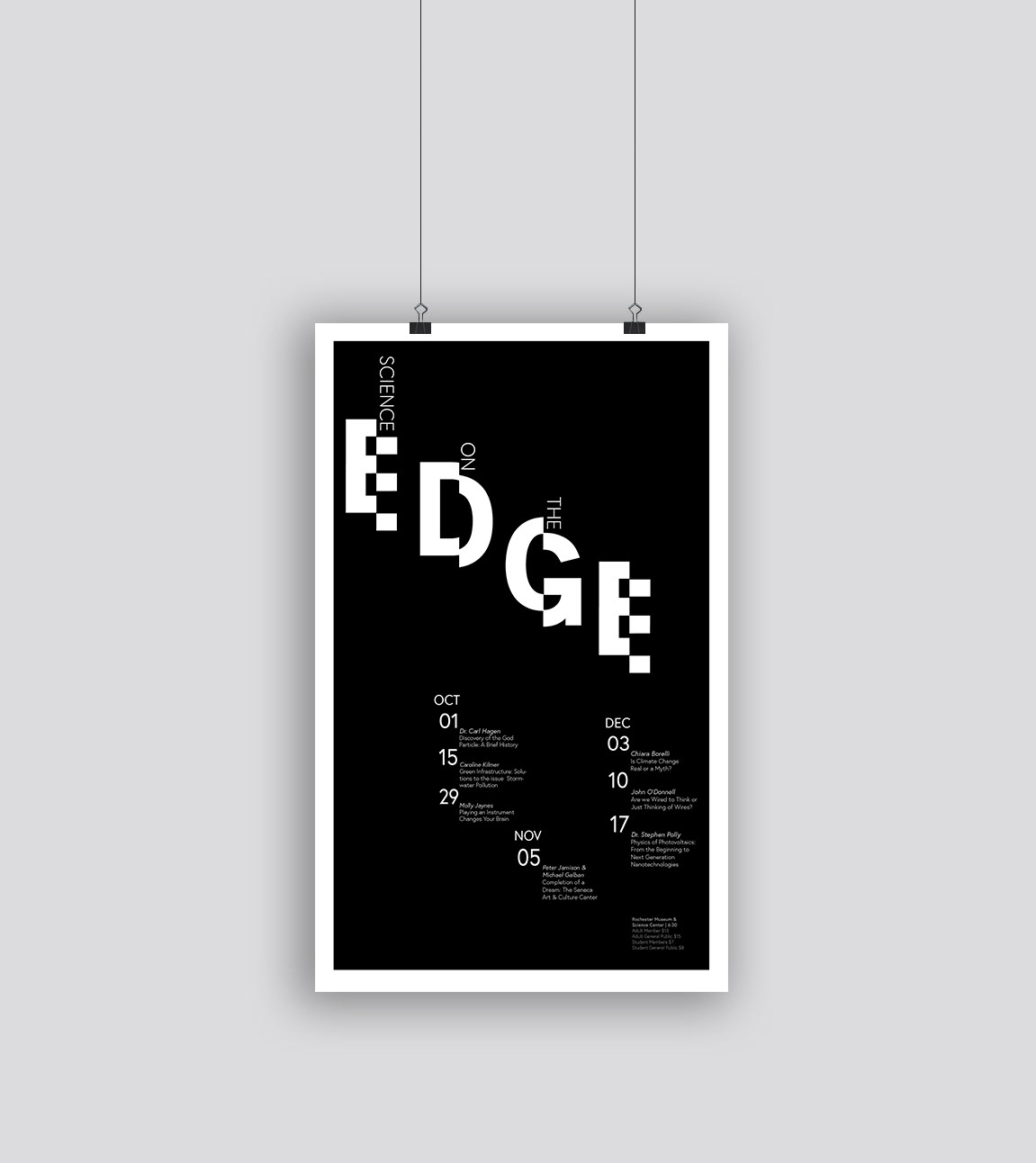
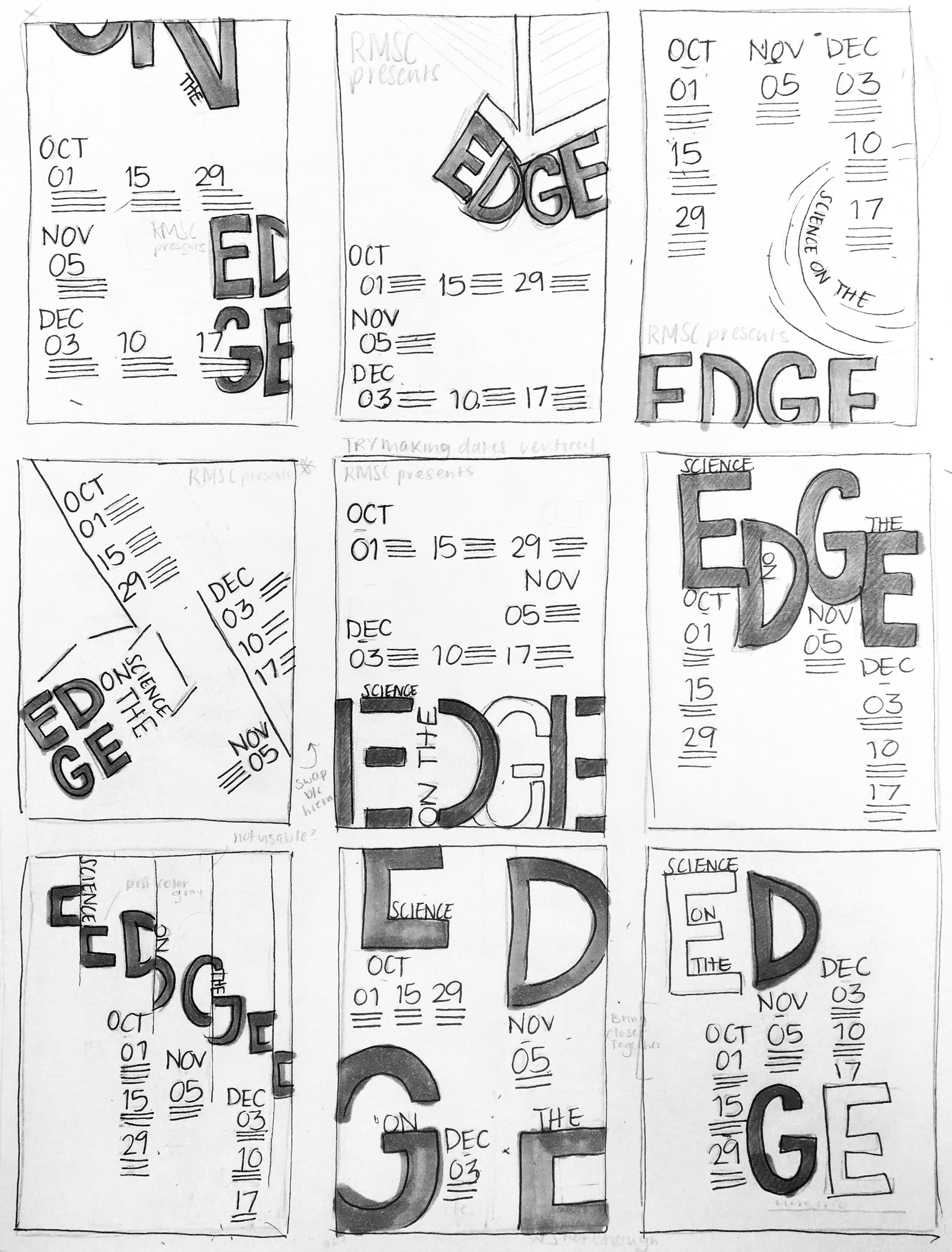
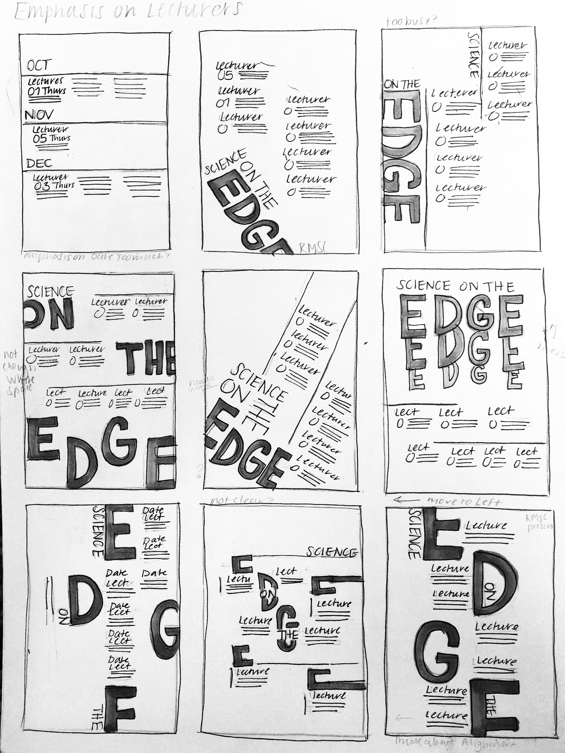
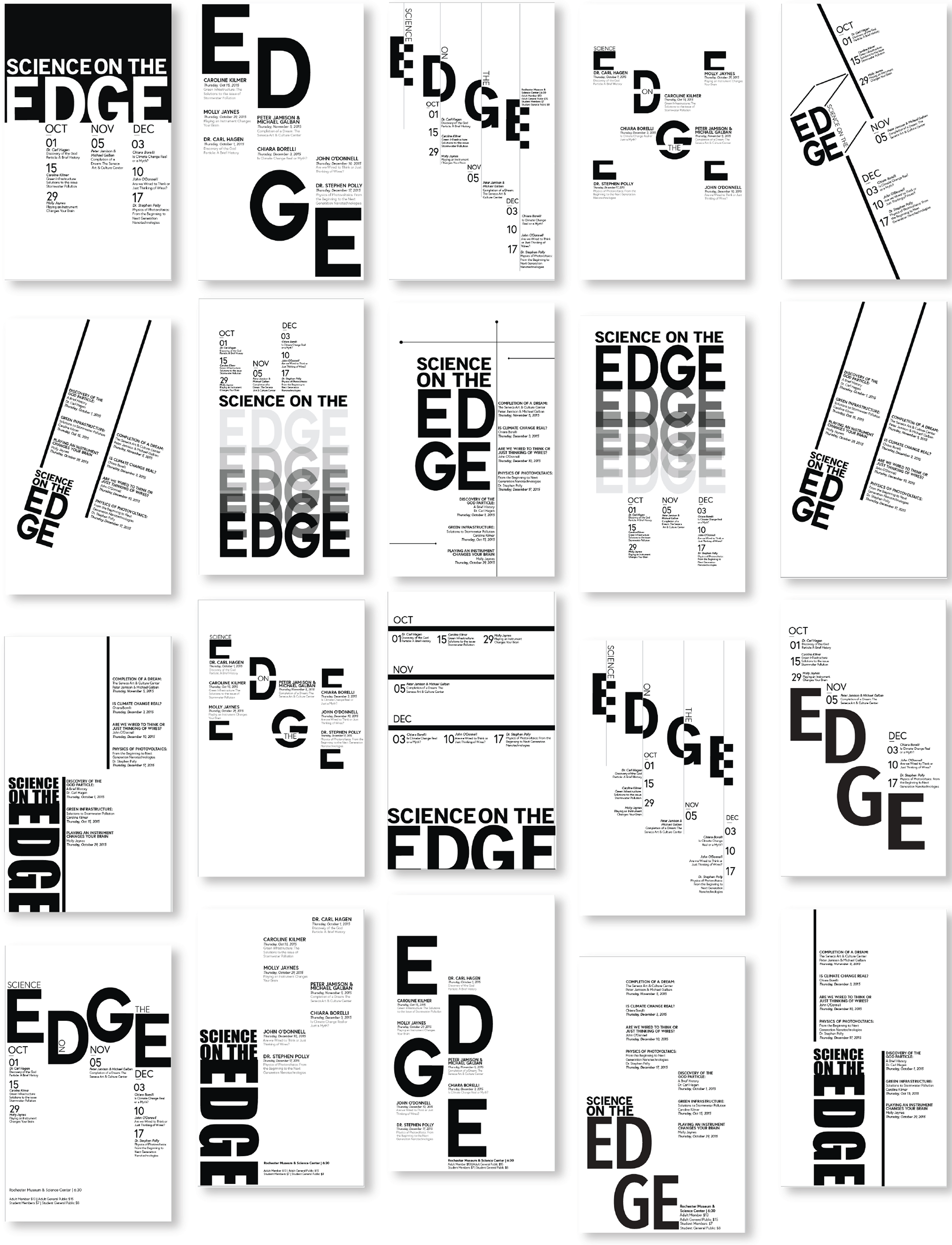
This project involved a redesign of a science lecture series that takes place at a local museum, Rochester Museum and Science Center. Along with this redesign was some design restrictions which were to focus on specific areas of the original poster. This means designing with a specific emphasis on dates or lecture topics along with a color restriction on all but one design
exploration
Addressing the design restrictions for this project involved specific emphasizes on lectures or topics along with color restrictions. Finding the best solution for each emphasis was a challenge but having sketched multiple ideas allowed for more explorations both on paper and digitally. Once I began to design them, I was able to play on contrast, color and font to create the bold design I had in mind when it came to executing them in a digital format
Color
Adding a Pop of Color
Using bold typography allowed these comps to be strong despite the fact that they needed some improvements in order to be pushed to the next level. This meant increasing text size, placement and adding more white space. By exploring these comps, I was faced with multiple design choices
Final
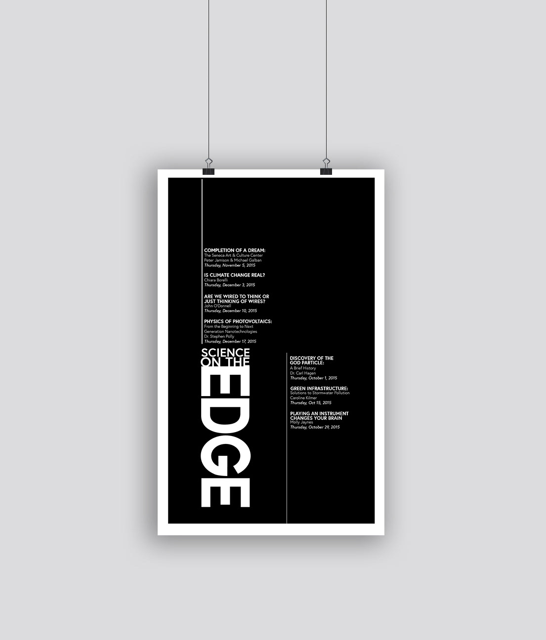
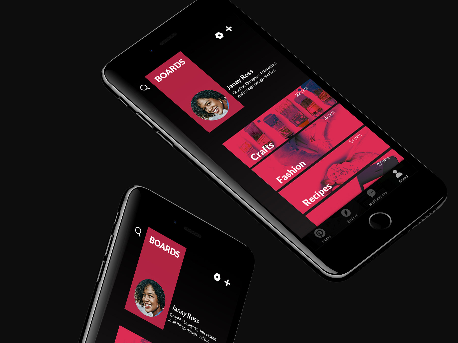
The Complete Series
For my final compositions I wanted to invert the colors even more contrast for an eye-catching final design, the white text on black gives it a dramatic feel but also forced me to try a new design style. As part of my goal, these final comps were meant to promote the look and feel of the event and therefore simple use of color and bold contrast allows these posters to be so effective.